Small Patio Color Ideas: 8 Ways to Build a Calm Outdoor Palette
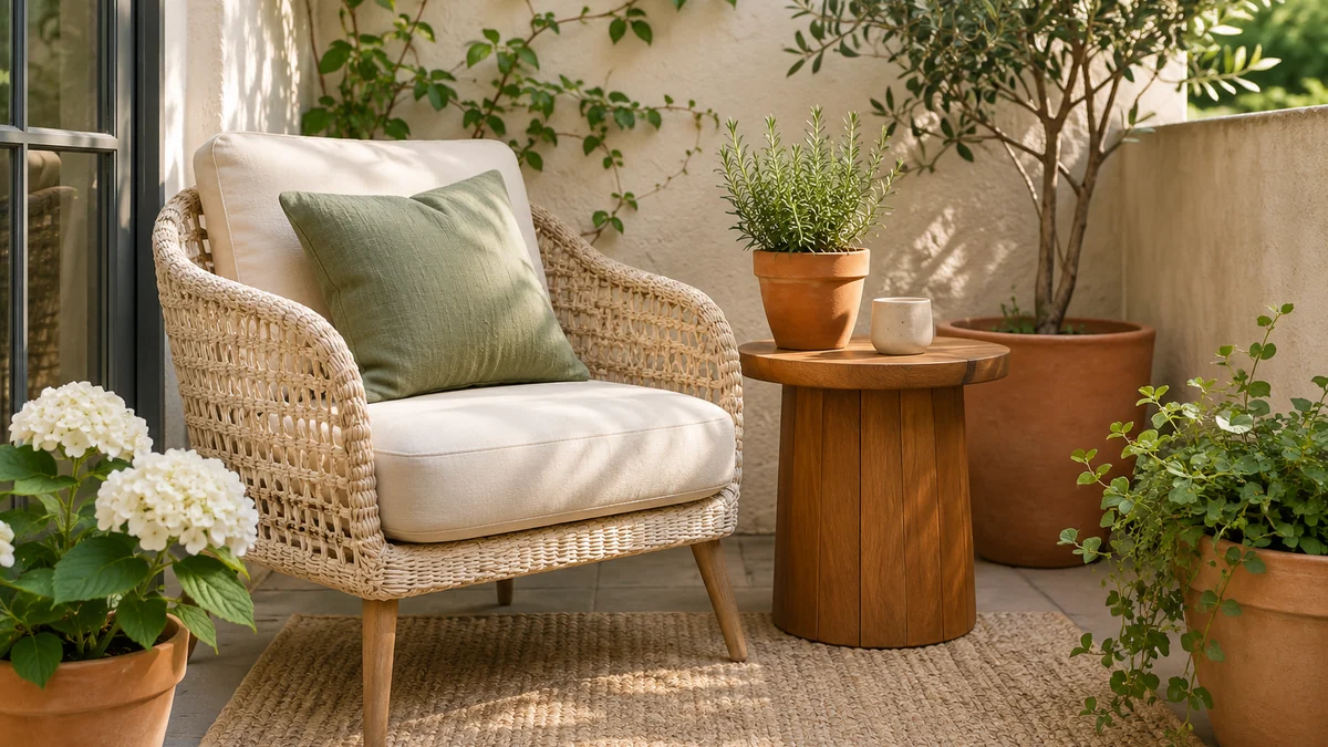
Small patio color ideas work best when they begin with the surfaces you already have. The paving, wall, door frame, and existing furniture occupy more visual space than a new cushion. When you notice those colors first, you can choose a few additions that connect the space instead of buying several attractive objects that compete with one another.
A calm palette is a design preference, not a rule that every patio must follow. You can use warm terracotta, cool green, soft cream, or a stronger accent and still keep the arrangement considered. The eight approaches below help you make deliberate choices with ordinary furniture and containers. For the practical order of a refresh, read our small patio decorating plan on a budget before shopping.
In this guide
- 1. Start with the fixed background colors
- 2. Let warm wood and cream provide the base
- 3. Use sage as a small, repeated accent
- 4. Bring warmth through terracotta containers
- 5. Repeat materials instead of adding more colors
- 6. Leave some surfaces visually quiet
- 7. Test one change in different light
- 8. Make the palette easy to maintain
- Try three complete palettes with the furniture you own
- Decide whether the contrast should come from color or shape
- Connect mixed pots without repainting the collection
- Use a sample log before buying the whole set
- Choosing between two possible palettes
- Plan the next part of your space
1. Start with the fixed background colors
Look at the patio in daylight and list its largest existing colors. Include paving, brick or stucco, the door, fences, and any furniture you intend to keep. A cream wall beside warm paving creates a different starting point from gray concrete and a black metal frame. You do not need to change the background to create a connected palette.
Take a reference photograph, but make final comparisons outside when possible. Phone cameras and screens can shift color, and the same fabric may look different in morning shade and afternoon light. A small physical sample is more informative than a product photograph viewed indoors.
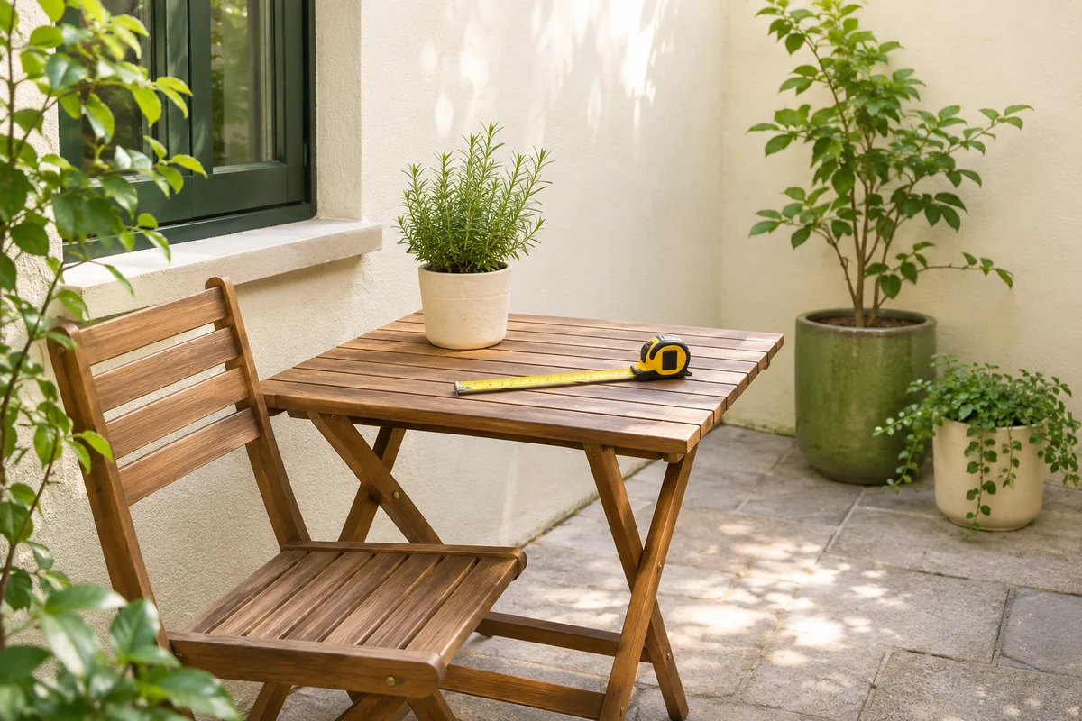
Choose which existing color will lead the arrangement. This might be the wood tone of a useful table rather than the wall. Then look for additions that sit comfortably beside it. If one fixed surface feels visually strong, leave surrounding details quieter instead of adding several competing accents. The goal is a clear relationship between pieces, not a perfect match across every material.
2. Let warm wood and cream provide the base
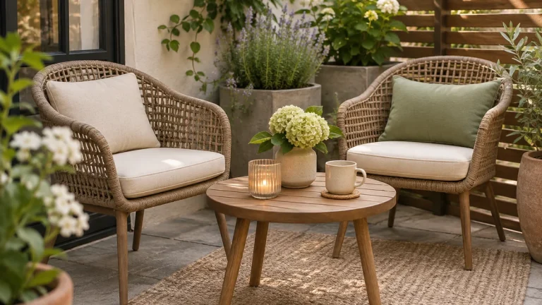
Natural wood tones and cream textiles can form a simple background for an outdoor seating corner. The contrast comes from texture as much as color: a woven chair, a smooth ceramic cup, and a soft cushion can feel varied without requiring many hues. Start with furniture that already works rather than replacing it to achieve a particular shade.
Cream covers still need practical care. Check whether a fabric is suitable for the exposure it will receive and read cleaning instructions before buying. A light-colored cushion that you can remove and maintain may suit the patio better than a larger decorative textile that is difficult to store.
Avoid treating every pale surface as interchangeable. Some creams lean yellow, others gray or pink. Compare samples against the wall and table so you can see the difference. If matching is difficult, choose a clear contrast in texture or tone instead of chasing a nearly identical shade. A deliberately varied natural palette often feels more comfortable than an imperfect attempt to make everything identical.
3. Use sage as a small, repeated accent
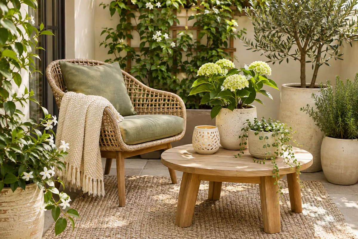
A muted green can connect furniture with nearby foliage without dominating the patio. Begin with one cushion or a small planter, then repeat the tone in another modest detail if it helps the arrangement. The repetition should guide the eye gently; you do not need a sage version of every object.
Compare the accent with the actual plants. Foliage ranges from yellow-green to blue-green, so a fabric that appears neutral indoors may feel noticeably different beside the containers. This variation can be attractive. Use it intentionally rather than assuming every green automatically coordinates.
Keep the main seat comfortable and functional. Choose an outdoor-suitable cushion in the right dimensions, with a realistic storage and cleaning plan. A decorative color should not be the only reason to buy a poorly fitting product. If your existing chair already has a strong color, try a smaller sage accessory or let the plants provide the green. The palette should accommodate useful pieces you own, not create a new shopping list.
4. Bring warmth through terracotta containers
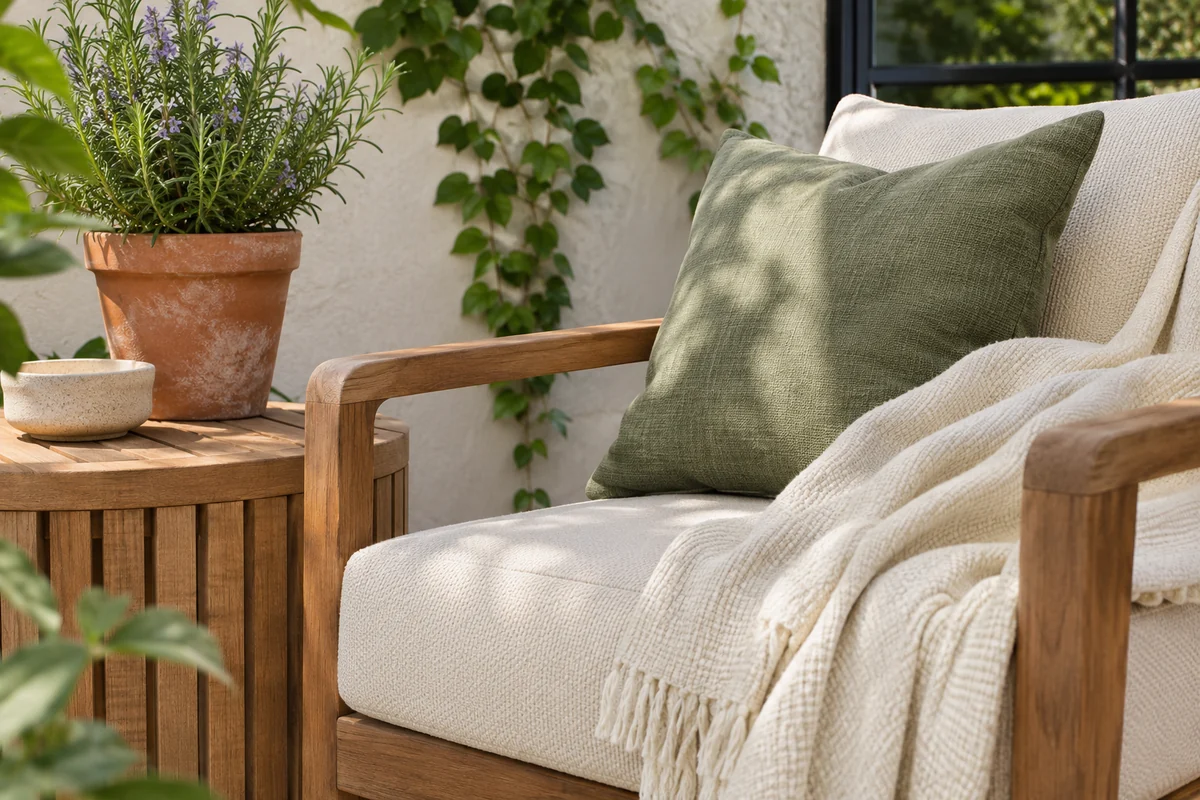
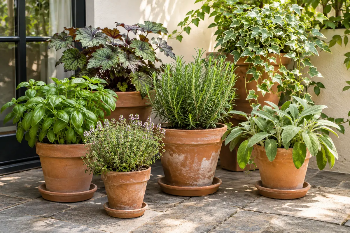
Terracotta tones can add warmth beside cream walls, green foliage, and wood. A small group of related containers often has more visual presence than several unrelated pots spread across the patio. They do not need to be identical; differences in size and surface texture can keep the group interesting.
Choose planting containers for the plants and location first. Color does not replace suitable drainage, manageable weight, or appropriate root space. If you want a decorative outer container, make sure the planting arrangement allows inspection and removal of excess water. Our container gardening guide for beginners covers these practical choices.
Notice how the pots look wet and dry, and how they sit against the paving. A warm container may blend into some backgrounds and stand out against others. Try the group in place before adding another accent color. In a very small patio, the combination of wood, terracotta, cream, and living plants may already provide enough variation to feel complete.
5. Repeat materials instead of adding more colors
When a patio feels disconnected, the answer may be repetition rather than another accent. A wooden table can relate to a wooden plant stand, or a woven chair can connect with a small woven detail. Repeated materials give the eye familiar elements to follow through the space.
Use this approach with restraint. A decorative object should still earn its place by supporting the way you use the patio or by providing a focal detail you enjoy. Several small accessories made from the same material can still create clutter if they occupy every surface.
Look for an existing connection before buying. Perhaps the chair legs already echo the door frame, or the table shares a warm tone with the paving. Make that relationship easier to see by removing a competing item. Photograph the arrangement before and after the edit. If the space feels calmer with fewer pieces, keep the simpler version and direct the budget toward comfort or plant care rather than extra decoration.
6. Leave some surfaces visually quiet
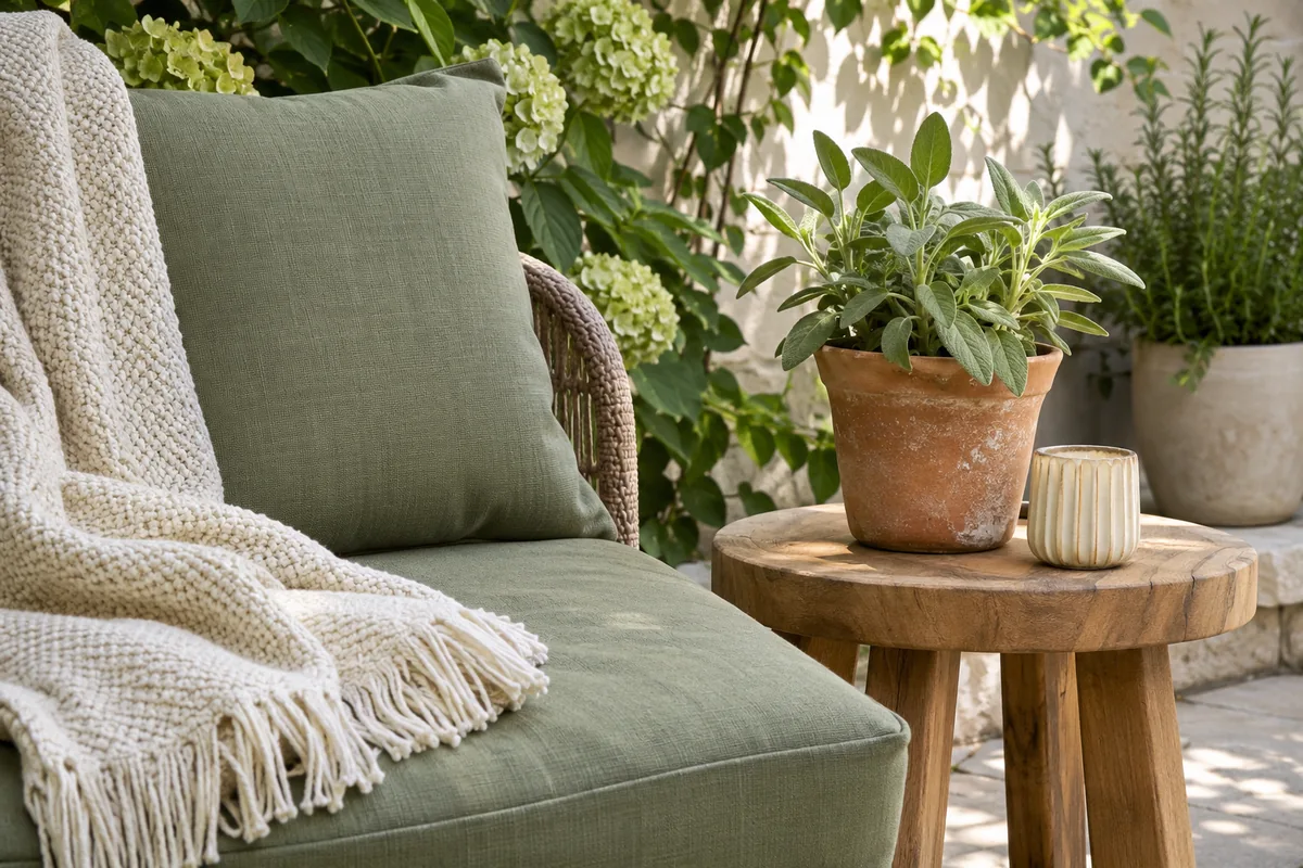
Color needs surrounding space to be noticeable. A small table with room for a cup can make one plant or cushion feel intentional, while a crowded table turns each object into background noise. Choose a limited number of places for decorative detail and keep the rest available for ordinary use.
This approach is particularly helpful when several fixed surfaces already have pattern or texture. Brickwork, weathered timber, and varied paving may provide enough visual activity without patterned textiles on every seat. Try a plain cushion before introducing another motif.
Quiet does not have to mean empty or sterile. The grain of a table, shadows across paving, and the outline of leaves add interest throughout the day. Arrange a useful seat, a clear route, and a few containers, then pause before adding more. A simple layout can make existing colors easier to appreciate. If furniture placement is the problem, revisit our small patio budget guide and solve the footprint before adjusting the palette.
7. Test one change in different light
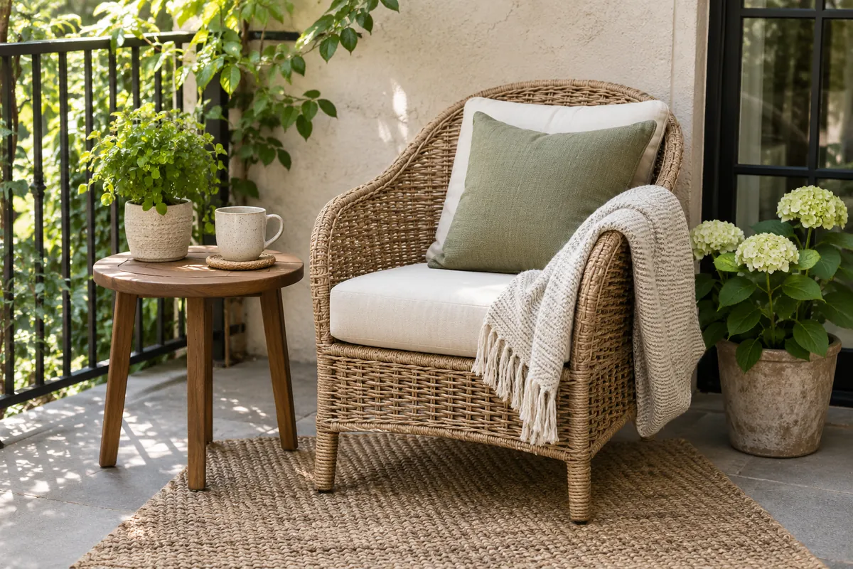
Introduce a new color in a small, removable way before committing to a larger purchase. A fabric sample or one correctly sized cushion can help you judge the relationship with the wall, plants, and furniture. View it during the hours when you normally use the patio rather than only at the brightest time of day.
Check the color from indoors as well. The patio may be visible through a door or window for much longer than you sit outside. A modest repeat of an indoor tone can connect the spaces, but the outdoor arrangement should still stand on its own.
Keep a short note of what you like and what feels wrong. Is the accent too strong, too cool beside the paving, or simply repeated too often? Change one variable at a time so the result is easier to judge. Buying several new colors together can make it difficult to understand which one improved the space and which one introduced the visual conflict.
8. Make the palette easy to maintain
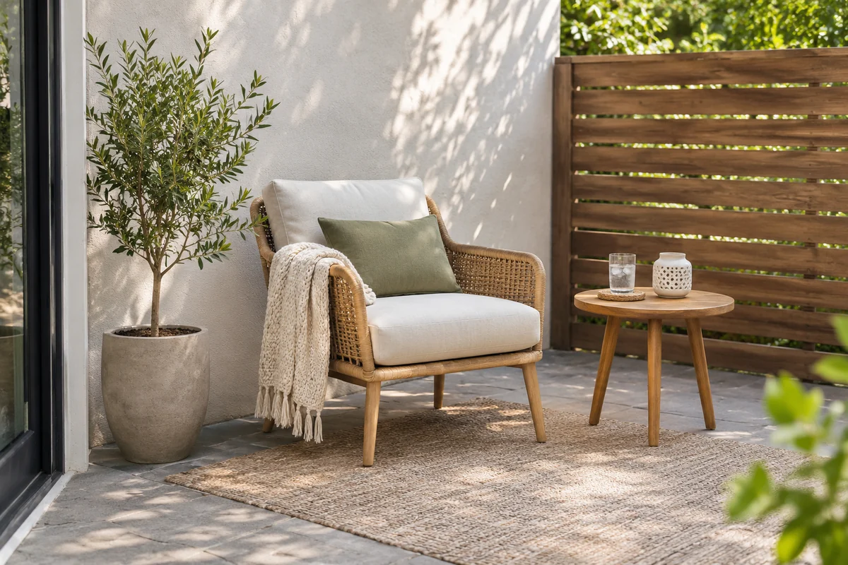
The most useful palette is one you can keep comfortable and tidy. Choose textiles suited to the conditions, check care labels, and decide where cushions will go during prolonged wet weather or seasonal storage. Do this before buying a larger set, especially when indoor storage is limited.
Avoid hiding drainage points or difficult-to-clean corners behind decorative groups. Containers should remain accessible for watering and inspection. Leave room to move furniture when cleaning the paving, and choose a number of accessories you are willing to bring inside when conditions require it.
Review the patio after a few weeks of use. You may find that one cushion and a coordinated pot group provide all the color you need. You may also discover that an item looks attractive but is always in the way. Remove or relocate that piece before adding something else. A palette that survives daily routines is more satisfying than a carefully styled arrangement that lasts only for the first photograph.
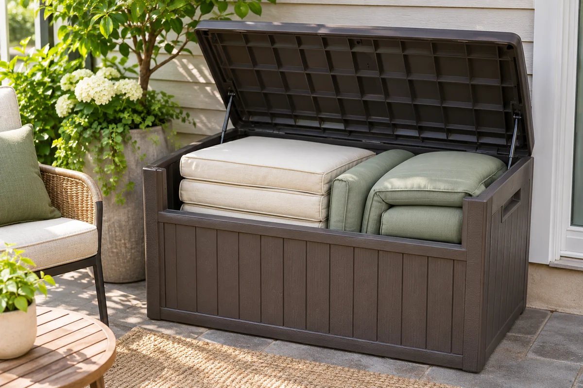
Try three complete palettes with the furniture you own
Choose a palette by making a small arrangement, not by collecting color names. Use the paving and the largest furniture piece as the starting point, then choose one textile and one container finish. The following recipes are design examples you can adapt. They do not require matching every object or changing a sound piece of furniture.
| Existing background | Textile accent | Container choice | Detail to keep quiet |
|---|---|---|---|
| Warm wood and pale paving | Cream with muted sage | Related terracotta tones | Table accessories |
| Gray paving and light wood | Dusty blue with cream | Sandy beige or a simple neutral | Additional fabric patterns |
| Dark frame and pale wall | One rust or olive accent | Plain terracotta or charcoal | The number of accent colors |
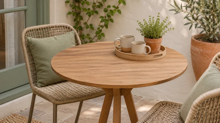
The illustration shows the dusty-blue option, offering a cooler alternative to sage. Test a physical sample beside the table and wall before choosing the final fabric. If an existing cushion already supplies the accent, let foliage and container texture complete the arrangement. Our outdoor cushion guide helps connect that color decision with actual seat fit and care.
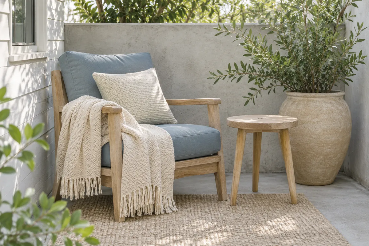
Decide whether the contrast should come from color or shape
Two different chairs can look intentional when one element connects them. A similar wood tone, a repeated cushion color or a shared dark frame may be enough. You do not need to make both the furniture shapes and the textiles identical. Compare the complete corner from the doorway before deciding what is missing.
If the silhouettes are already varied, start with plain fabrics. If the chairs are very simple, one modest pattern may be the detail you enjoy. Put the sample on the chair and view it beside the pot group. A pattern that looks restrained in a small online swatch can feel much stronger across a full seat and back.
Keep the comfortable chair in the comparison even when it does not fit your first imagined palette. Redesigning the accent around a useful existing piece can be less costly than replacing furniture to match a sample. Our small patio furniture ideas explain which comfort and footprint decisions should come before the decorative finish.
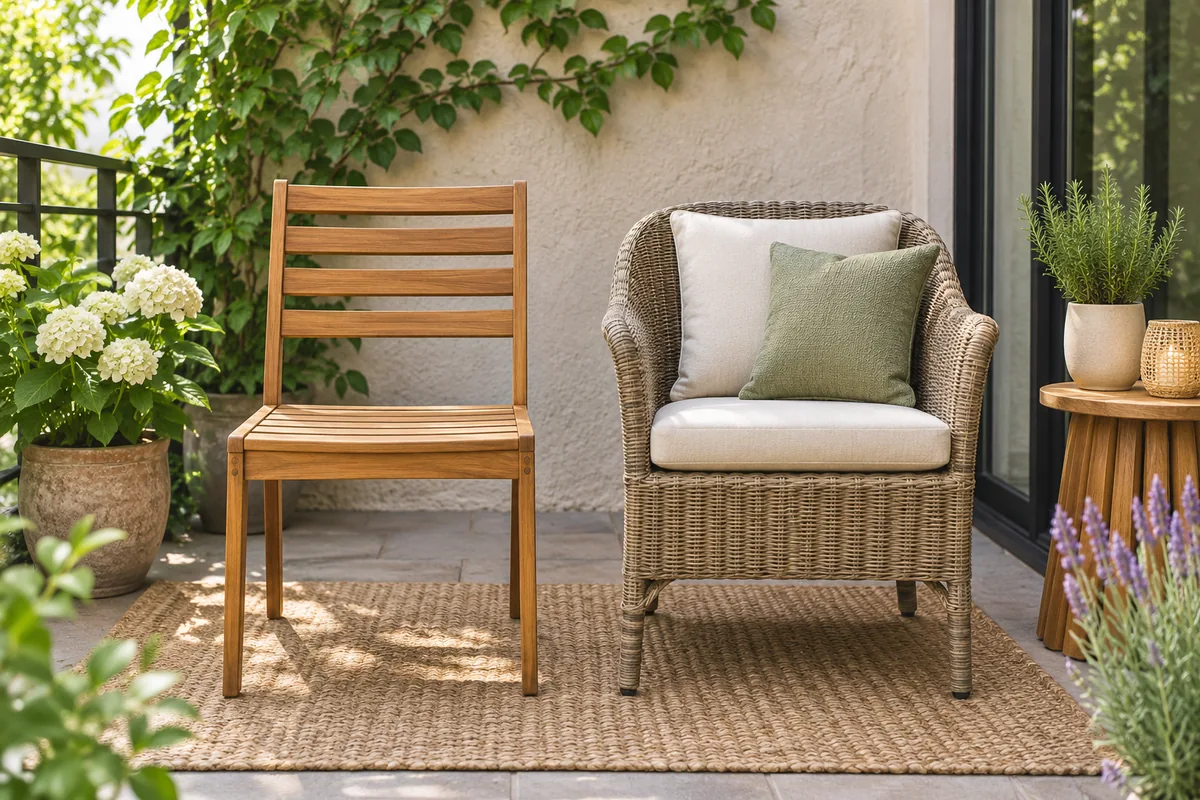
Connect mixed pots without repainting the collection
Different pot sizes are often necessary because the plants need different root space. Create a relationship through grouping, not by forcing every plant into the same decorative container. Put the related finishes near one another and leave some visible floor around the group so its outline reads clearly.
For example, place two terracotta containers beside a neutral pot whose tone repeats the wall or cushion. Let foliage provide variation in shape and height. If a strongly colored pot draws attention away from the main seat, try moving it to another suitable growing position before buying replacements. The plant’s light and care requirements still decide which positions are possible.
Compare a wet container with its dry appearance when judging the finish. Weathering and ordinary use can change the visual relationship over time, and that variation may suit the space. Our balcony plant arrangement guide helps you combine different sizes while preserving access. Avoid painting planting containers solely to match a palette without checking material suitability, product instructions and the needs of the plant arrangement.
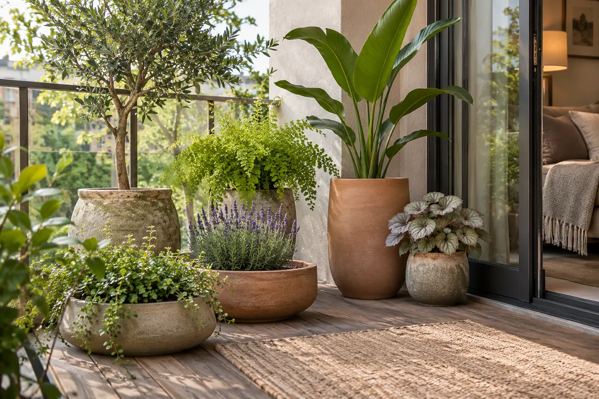
Use a sample log before buying the whole set
Create a simple comparison note with four entries: the sample, the existing surface beside it, the time of day and your reaction. Describe what you actually see, such as too blue beside the warm wall or pleasant beside the wood. Those observations are easier to act on than a vague feeling that the patio needs more color.
Compare only two options at first. Look during the hours you use the space and through the adjoining doorway. Keep the chair, table and plant group in the same positions so a layout change does not confuse the color comparison. Photographs can help you remember the options, but judge the real samples outside whenever possible.
After a few days, choose one small purchase or keep the existing version. The result does not have to become a full coordinated collection. A useful table, comfortable chair and a few related containers can form a complete palette. For the final tabletop, see our small patio table decor ideas and keep the working surface available.
Choosing between two possible palettes
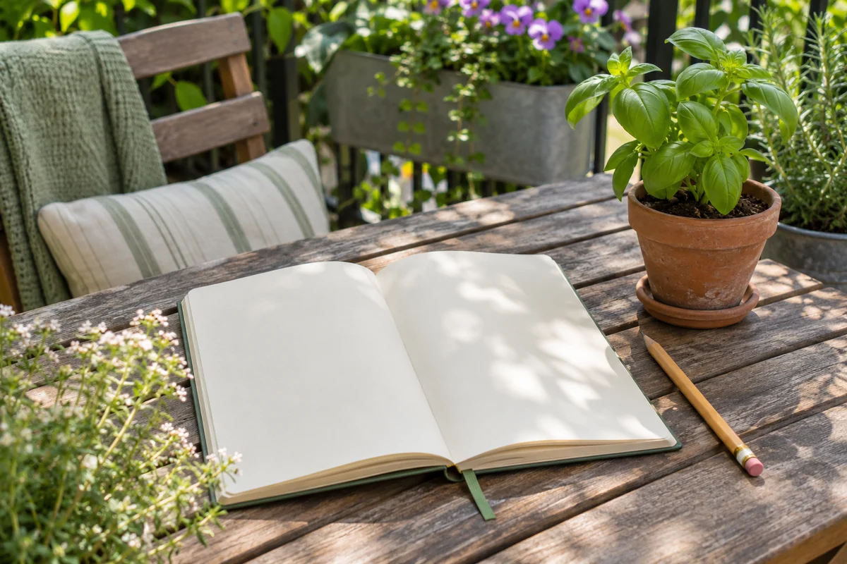
If you cannot decide, compare two small combinations using the furniture you already own. One option might repeat cream and wood with a sage accent; another might use cream and terracotta with foliage as the only green. Place the samples beside the wall and paving, then look from the seat and from indoors. Choose the option that supports the existing space with the fewest replacements.
Do all the pots need to match?
No. Repeating a related material or tone can connect different shapes. Choose each pot for its planting purpose and practical handling, then arrange the group visually.
Can a small patio use a strong color?
Yes. Start with one focal detail and compare it in the actual light. Strong color is a design choice; the useful question is whether you enjoy it beside the surfaces you already have.
Should I repaint outdoor furniture to match?
First check whether cleaning or rearranging solves the problem. If you decide to refinish, follow the furniture and coating manufacturers’ preparation and use instructions, along with any property restrictions. Do not choose a coating solely from its color name.
Plan the next part of your space
Continue with our small patio layout ideas guide for a related part of your setup. For another practical starting point, explore small container herb garden and adapt the ideas to your space.
Save this guide for later
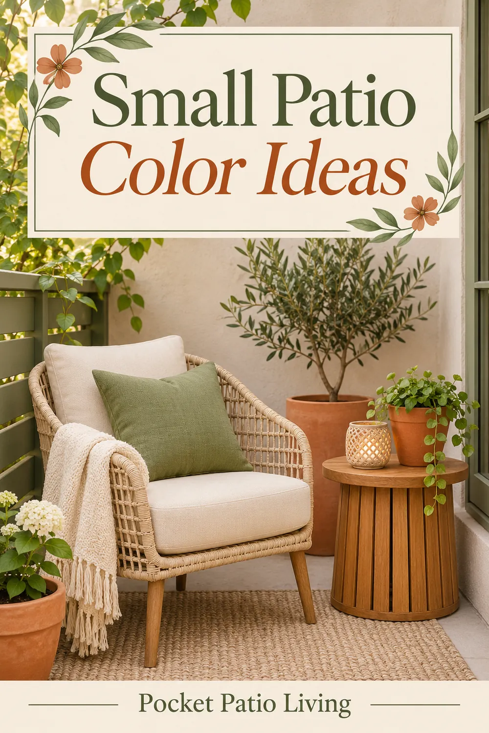
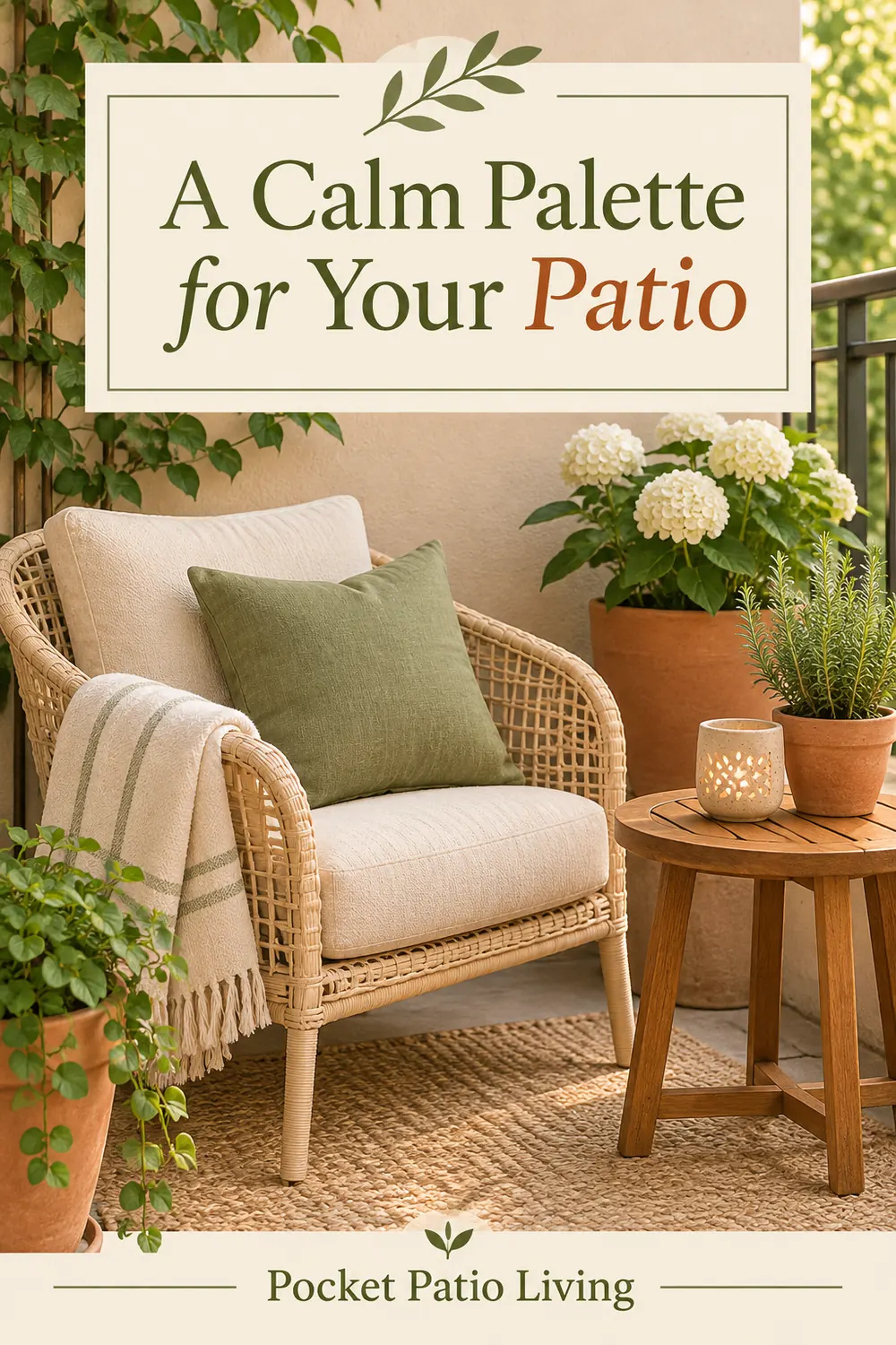
Save one of these Pinterest-style designs for your next outdoor-space planning session. All article images are design illustrations.